
We’re thrilled to announce our partnership with Xiongxin Technology, who have entrusted us with 8 exciting logo design projects for their diverse portfolio of companies. This collaboration presents a valuable opportunity to develop distinctive, industry-specific, and internationally oriented visual identities for the eight companies led by Xiongxin, highlighting their forward-looking vision and innovative spirit.
As we celebrate the launch of Xiongxin Technology’s first logo, we’re excited to share the creative journey behind it:
Design Concept
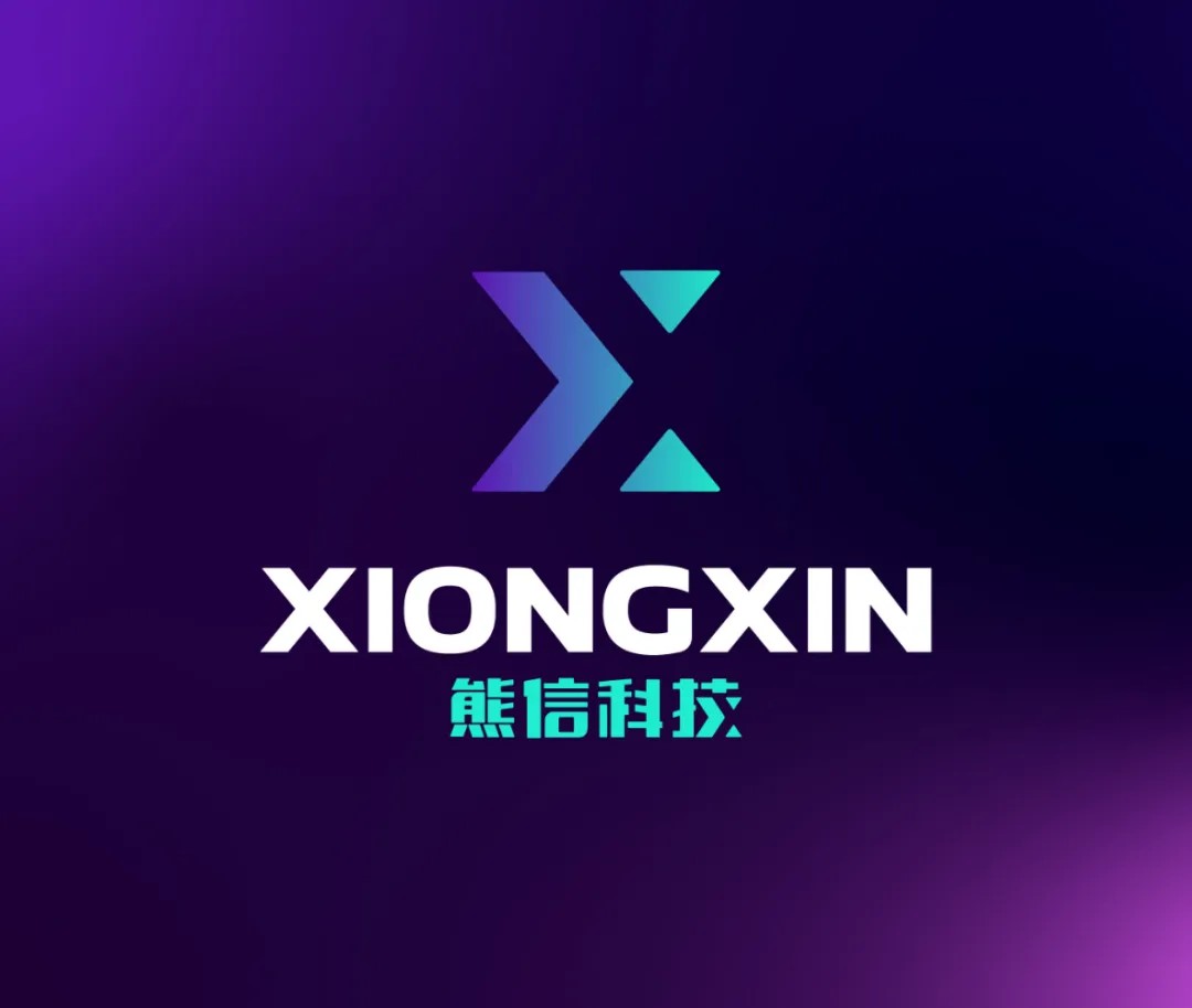
The logo is a blend of technological sophistication and global ambition. A dual-colored gradient from blue to teal symbolizes trust and innovation, two core values driving Xiongxin’s presence in the international market. Blue stands for reliability and stability, while teal injects a sense ofcreativity and future-focused energy.

Typography
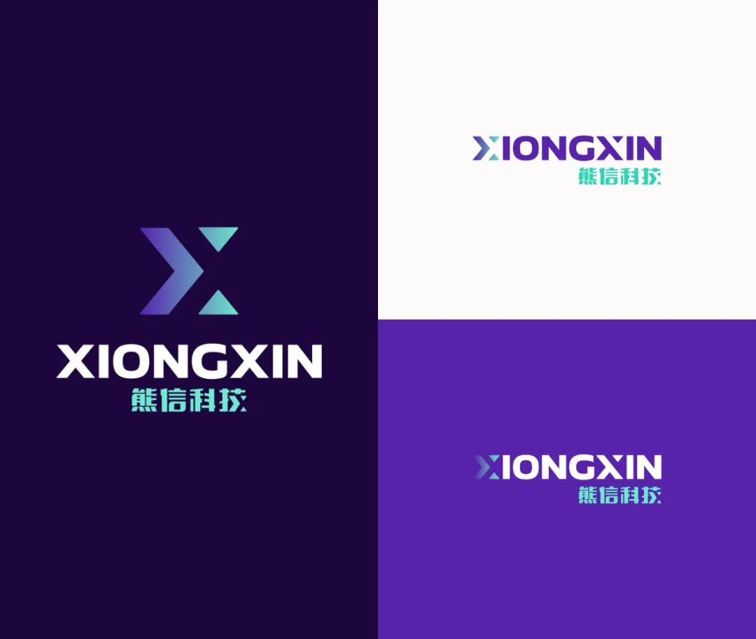
Bold, capitalized English letters for “XIONGXIN” reflect global aspirations, while the inclusion of “熊信科技” in Chinese honors the company’s roots. Together, the design bridges local identity with global expansion.
Symbolism
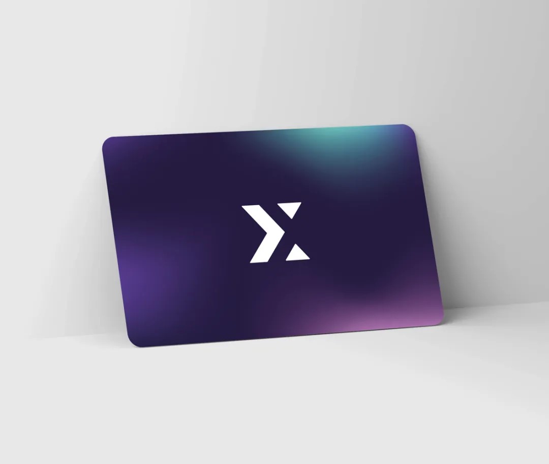
The “X” icon is more than just the first letter of the brand—it represents crossroads and convergence, symbolizing Xiongxin’s role in connecting technologies and people across borders. Its sharp, dynamic shape reflects the agility and precision crucial to the fast-moving tech industry.
Cultural and Global Appeal

Designed to resonate with both Eastern and Western audiences, the minimalist aesthetic appeals to tech-savvy professionals globally, while the Chinese characters anchor the brand in its home market. This duality aligns perfectly with Xiongxin’s global growth strategy.

What Our Client Says
