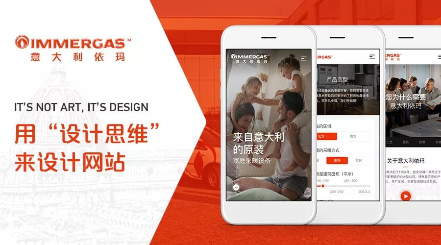
It’s Not Art, It’s Design

4 min read September 17, 2018

Established in 1964 Italy, Immergas has become a global leader in the manufacturing and sales of condensing boilers AKA how many of us will heat our homes this winter.

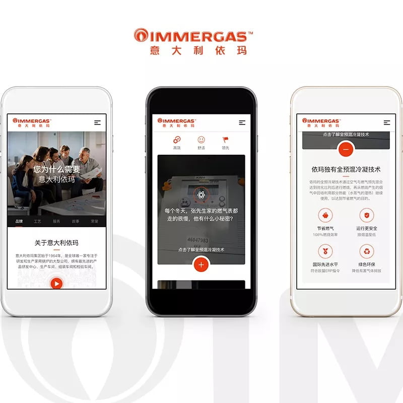
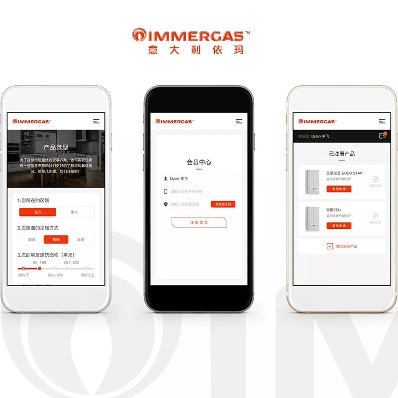
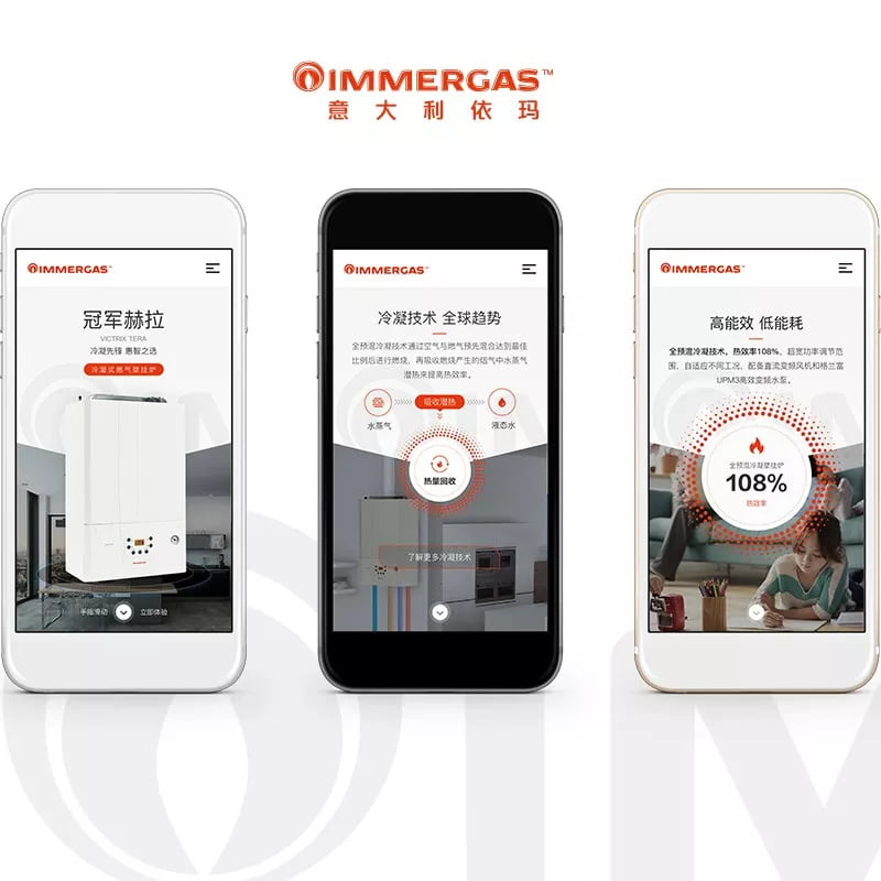
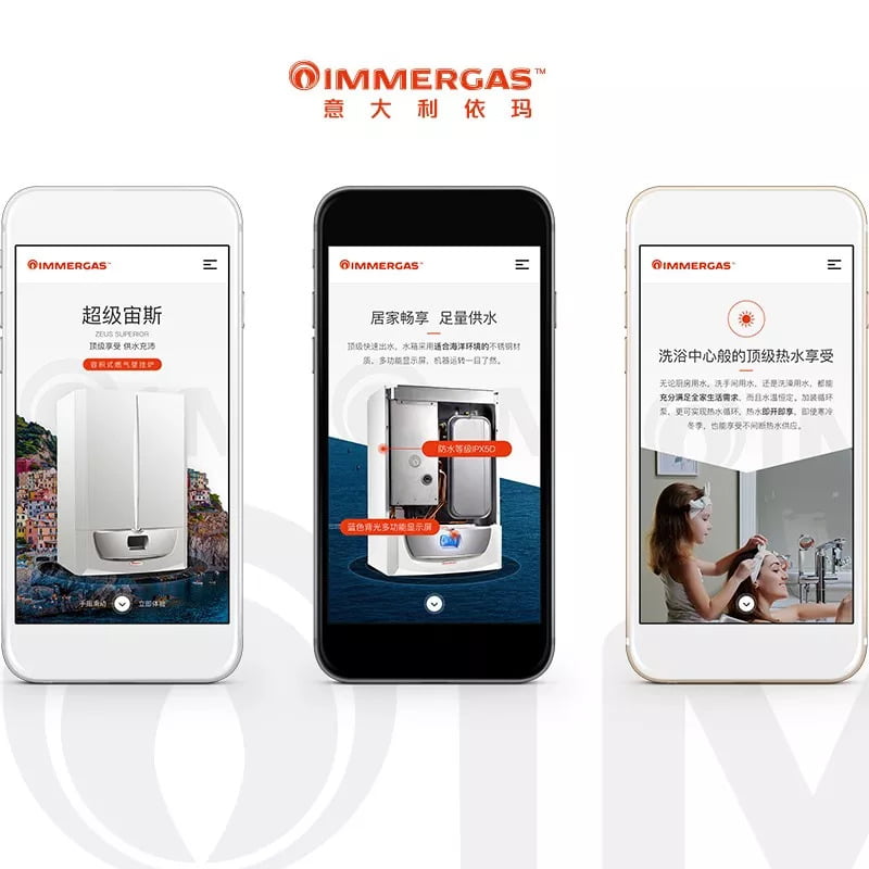
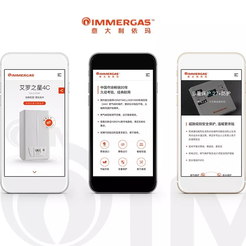
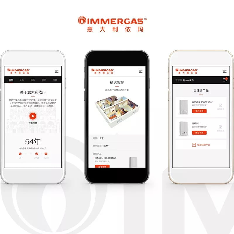
We worked with the Immergas team to bring their WeChat marketing vision to life, and since many people have asked about our design approach, we decided to give you an in-depth look at how Flow implements the design thinking method to create thoughtful and useful design.

Step 1: Empathy

1. Know your users

In UX, users are broadly divided into three categories:

  • -Users who are in direct contact with the product, in this case, people browsing the website
  • -Users who are in indirect contact with the product, such as users who receive links forwarded to them by friends or relatives
  • -Users who provide internal support for the product, such as back-end website administrators

There are many subcategories of these three types of users to consider, for example, different ages, different backgrounds, the internal marketing team and other competitors in the industry. Understanding the main stakeholders and the needs of each user’s profile is the driving force for decision making.

2. Know them well

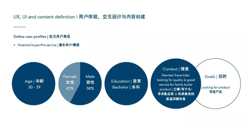
Once the user types have been defined, we get to work getting to know each one very well, analyzing and researching each type to create a user profile. We think about what their job is, what they do for fun and even what they share on social media, painting a story of the different aspects of the person’s life. This helps us understand when and how they will interact with the product and the site.
,

Step 2: Design Inspiration

1. Hypothesize

When we clearly understand the needs of different users and visualize them into user profiles, we began to realize their needs, and make educated guesses about their habits and play out scenarios of their website interactions.

User Profile:

A middle-aged, married, highly educated, woman, who pursues a high quality of life, expects high quality in the products she buys, and is likely to do research before she purchases a product that is as important as heating her home for her family.

Her goal: Purchasing a boiler

We hypothesize:  She will want to know key pieces of information about the product specs, how it rates on safety, and how it is for environment, even before the price when choosing to purchase.

With our hypotheses disproved or further detailed through user research- surveys, interviews and competitor analysis- our designs have a foundation and direction.

,

Step 3: Prototype

1. Copywriting

Copywriting is also a part of UX and design. With much collaboration with the Immergas Marketing Department we worked to create the digital language that incorporates the online strategy, each menu item and each button is worded with thought.  Our goal here was to create text which guides and interests the user.

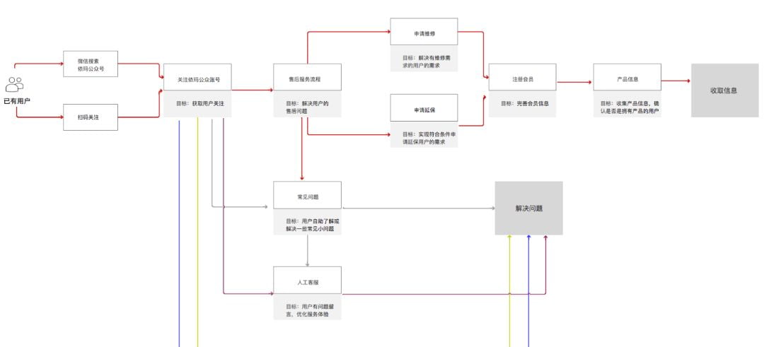
2. Flow chart

The website is like a virtual building. When different users come to visit with different needs, how will they enter and navigate, at what moments will they be presented with content to reach the ultimate goal of conversion?

,

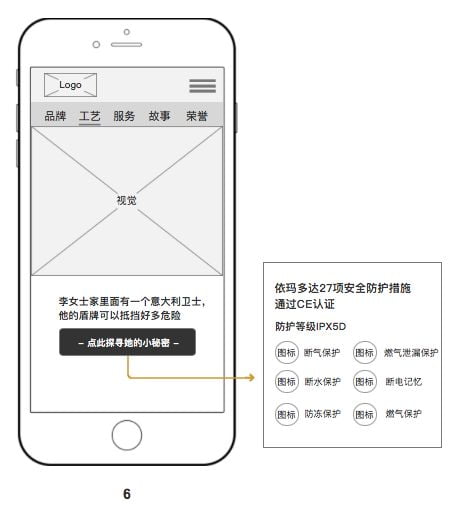
3. Wireframes 

Before implementing visual design, based on the user flows and conversion goals, the information is architected and the wireframes for each page are made.

,

Step 4: Design

1. Visual Design

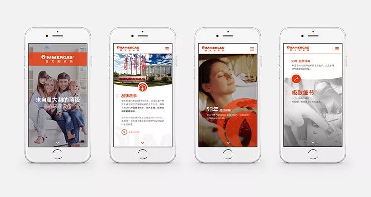
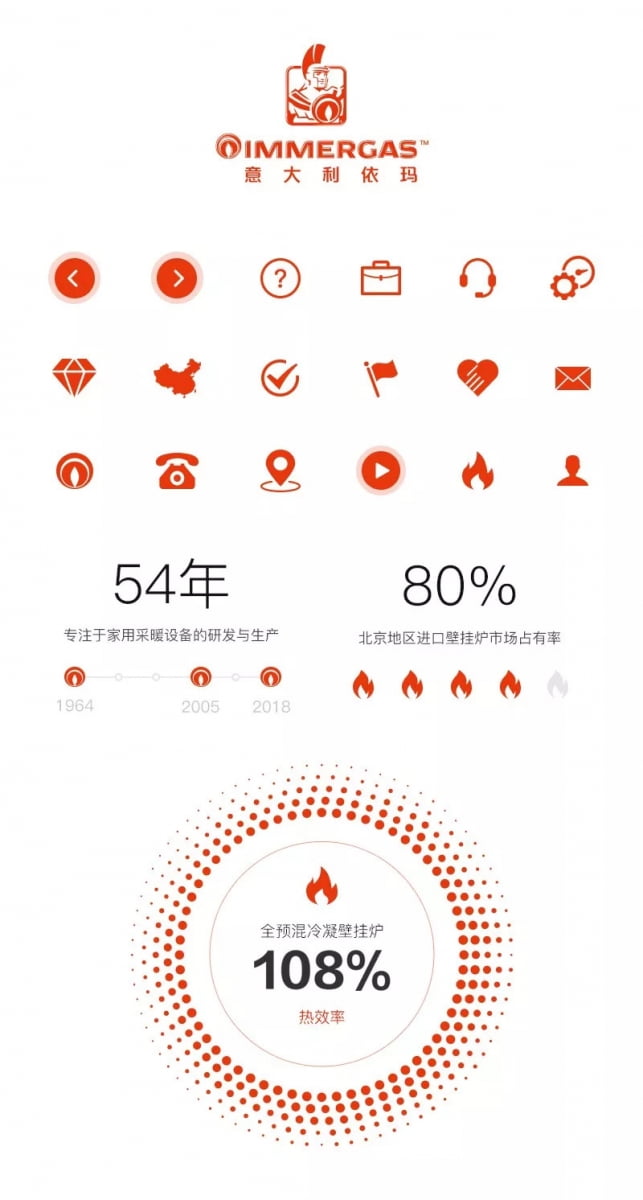
The Immergas web stylesheet visually represents the passion and colorfulness of high quality Italian life. Of course consistent with the corporate guidelines, we aimed at providing a stylesheet that could provide the elements needed to create an experience that highlights quality, trust, energy efficiency and the global presence of Immergas.

,

2. Web design

We typically prepare 2-3 concepts of the homepage to present to the client. This futher provides us with opporuntities to test the impressions of the design on potential users.

3. Interaction Design

As you read last week, our general philosophy on interaction is to incorporate interactions when they positively add something to the experience, ie a more interesting way to learn about the product, but to not add an interaction just to be flashy, which could detract from the information.

,

Step 5: Testing

1. Real users try it out

After internal testing it is important that the product is tested on new users who fit the correct demographic. Often it can happen that internal testing overlooks something because we are too accustomed to interacting with the website or even digital products in general. Struggles and delights from real users provide key information to make products that evolve with the user.

2. Make adjustments

When a website is made intuitively, you might not even realize it, usually when you have to question why something works the way it does, it is breaking the flow of your navigation.

Thanks to Immergas for being a part of this journey, and in their words:

“Thanks to our consumers, Immergas products have been passed down through the generations for over 50 years. We found Flow through an introduction from one our friends. We knew that this was their first time designing a website in our specific industry. I was worried this would be a problem at first, but as the project progressed, we understood that because of their process, they could be professional and trustworthy in any industry. Thanks to Flow for designing our minisite, because of it, we can to provide warmth more simple and more effectively.” -Ms. Star, Immergas Beijing Marketing Department

,

Scope

  • Copywriting
  • User experience design
  • Mobile design
  • WeChat integration
  • WordPress-based content management system development

Check it out here:  Click here

Related articles

Singles’ Day in Numbers: Key Trends You Should Know

Singles’ Day in Numbers: Key Trends You Should Know

0 min read
November 21, 2024
How to Create and Verify a Douyin Account for Overseas Companies

How to Create and Verify a Douyin Account for Overseas Companies

3 min read
November 19, 2024
Let’s Talk.

Ready to expand into the
China digital ecosystem?

1999 characters left
This field is for validation purposes and should be left unchanged.