
From maxi web design to clean logos and empty space
21st century brand identity design China does not have a reputation for minimalism. Brands vied for attention with a million logos, slogans and product images from every angle.
In contrast to minimal branding design, Chinese graphic design left no space on a webpage deliberately blank, and no typeface out of the equation. China branding agencies and their China brand clients equated busy graphic design with strong and growing trade, massive consumer choice, and fun for the casual reader.
The problem was, webpages and promotional marketing material for China-based brands needed the reader’s full attention just to unpick what the offering actually was!
Minimalist logos rule the world
The logo design Chinese community has watched closely as international superstars Nike, Adidas, Google, Starbucks and Apple nodded in approval at their branding agencies pushing a minimalist approach to visual identity design.
They saw Apple’s famous apple silhouette as a perfect example of minimalism. The design is simple, recognizable, and perfectly aligned with the brand’s ethos of innovation and user-friendliness.
The monochromatic color scheme enhances its versatility, allowing it to be used across various media seamlessly. In Nike’s swoosh, Chinese graphic designers saw one of the most iconic logos sweet the world.
Its simple, clean lines convey motion and speed, aligning perfectly with the brand’s focus on athleticism. The lack of complex shapes or text makes it easily recognizable and memorable.
Tech taste for simplicity grows
Chinese logo design agencies have since worked in sports and tech brands in apparel, electronics, and electric cars, industries that have led the way in popularizing minimalist branding design in China. Minimalist logo design for tech companies in China is now mainstream rather than the odd choice.
Brand identity design China
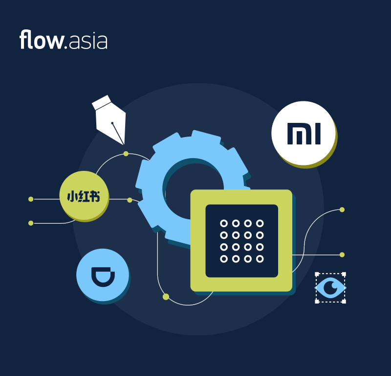
Despite interest from the Chinese design community, it took smart device maker Xiaomi and its generation of fresh tech superstars to upend busy graphic design, and land the era of minimalist logo design in China. For Xiaomi, minimalism is about far more than branding material, as the company has set about creating sleek, user-friendly electronics and appliances that are aesthetic and functional.
Clean logo design
Simple logos and visuals, spearheaded by tech firms such as Xiaomi and media apps like Xiaohongshu with its clean red Chinese logo, have reframed the purpose of promotion: to offer readers a straight-forward proposition. From tech and media, the trend has spread, as Chinese restaurant logo design and Chinese food logo design promoters recognized the benefits of branding clarity for attracting clients to their preferred digital platforms.
Other companies are still on the way to minimalism, and are taking their time. Compare Didi’s “regular” app and their “simplified” mode targeted elderly consumers. One is stuffed with information on services and offers while the other is much closer to the design aesthetics and interactions of Uber, a US-originated minimalist-driven brand. If only Didi recognized the value of its simple site were apparent far beyond the older consumer cohort!
Don’t consume, don’t clutter – an eco-trend
With China on a drive towards a carbon-neutral future, an emerging trend in minimalist design in China emphasizes sustainability, encouraging the use of eco-friendly materials and efficient, resource-conscious practices.

