Westerners often have the initial impression that many Chinese websites feel overwhelming, overcrowded or confusing. It is understandable, especially if the person cannot read Chinese, but there are specific reasons for these, often significant, differences between Western and Chinese web design.
One reason is that because of the nature of Chinese characters- each word is not a sequence of characters, but rather each word is represented by the shape of the character itself- it is more complex to develop a search feature that returns accurate results. As a result, web designers compensate by putting as much content as possible on a single page to make it easier for users to explore. Another reason is that companies focused on creating mobile solutions over the last decade, and thus may not have updated their desktop website. Futhermore, the way Chinese characters are read is simply different than the way a Latin language is read.
Since 2018, there has been an increase in minimalistic web design in China, but given the unique China digital ecosystem and Chinese characters, there will always be some differences. Nielsen Norman Group conducted an interesting study that revealed that the average Chinese user prefers a simple web design that still maintains a considerable amount of information upfront.
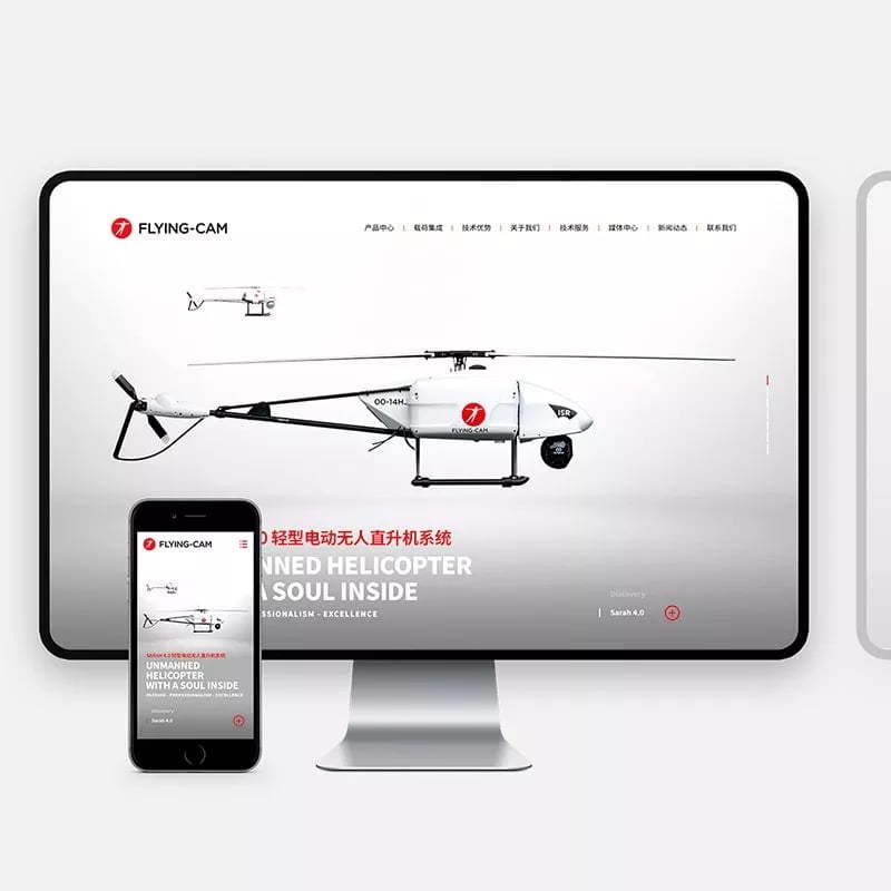
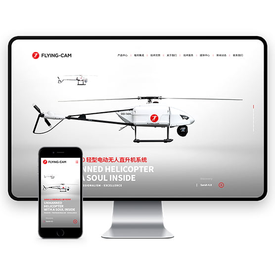
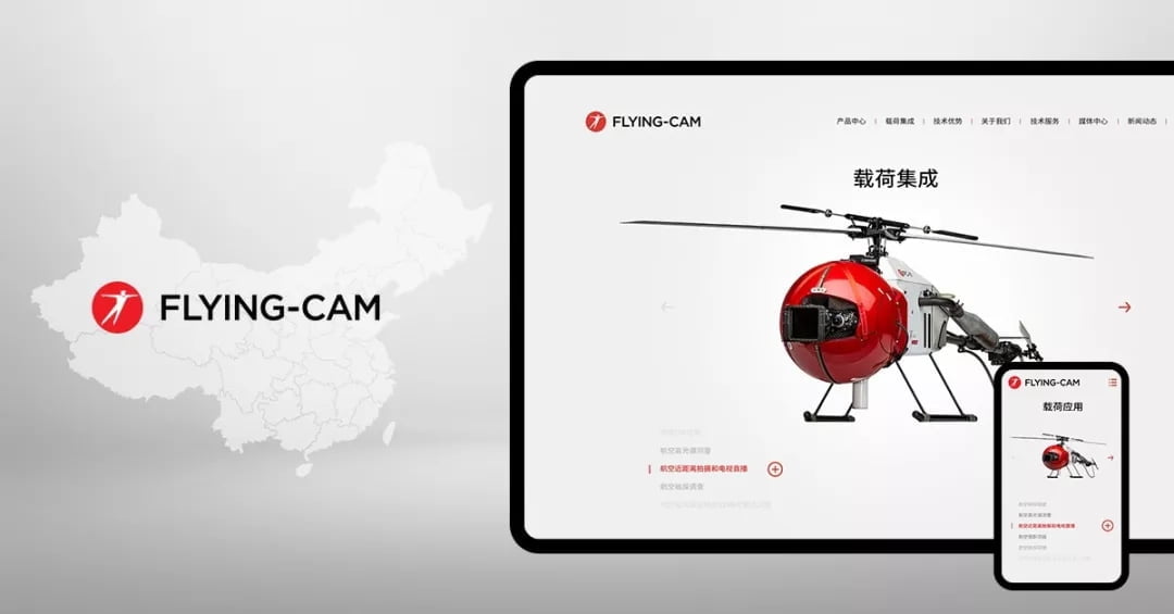
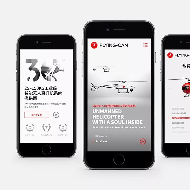
Case study: FLYING-CAM China website
Founded in Belgium in 1988, FLYING-CAM, is a provider of 25-150KG industrial grade intelligent unmanned helicopters, and is the world’s first closeup aerial photography company.
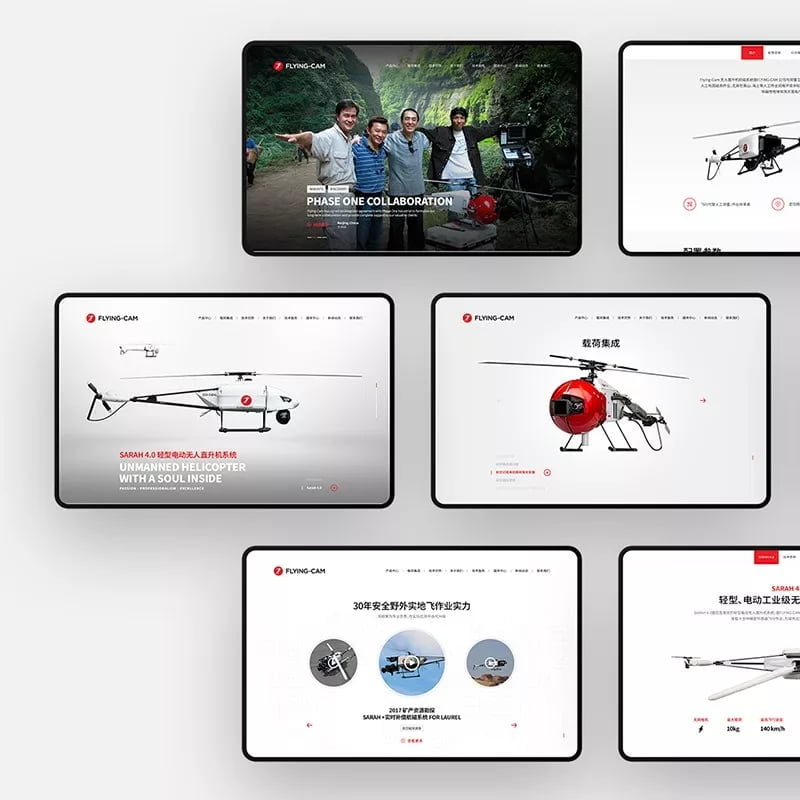
Scope:
- User research
- User profiles
- User flow
- Desktop and mobile website design
- Made-for-China technical specifications
- Website development
Target audience
B2B: Geophysical exploration agencies, marine survey research institutes, engineers and aerial photography personnel located in China.
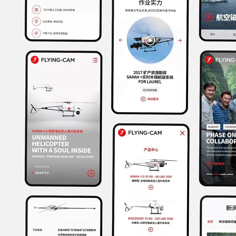
Check it out at: flying-cam-china.com

