The Balance Between Trendy and Sustainable

2 min read August 27, 2018

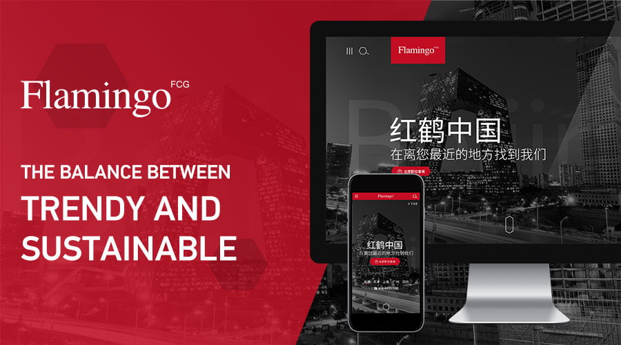
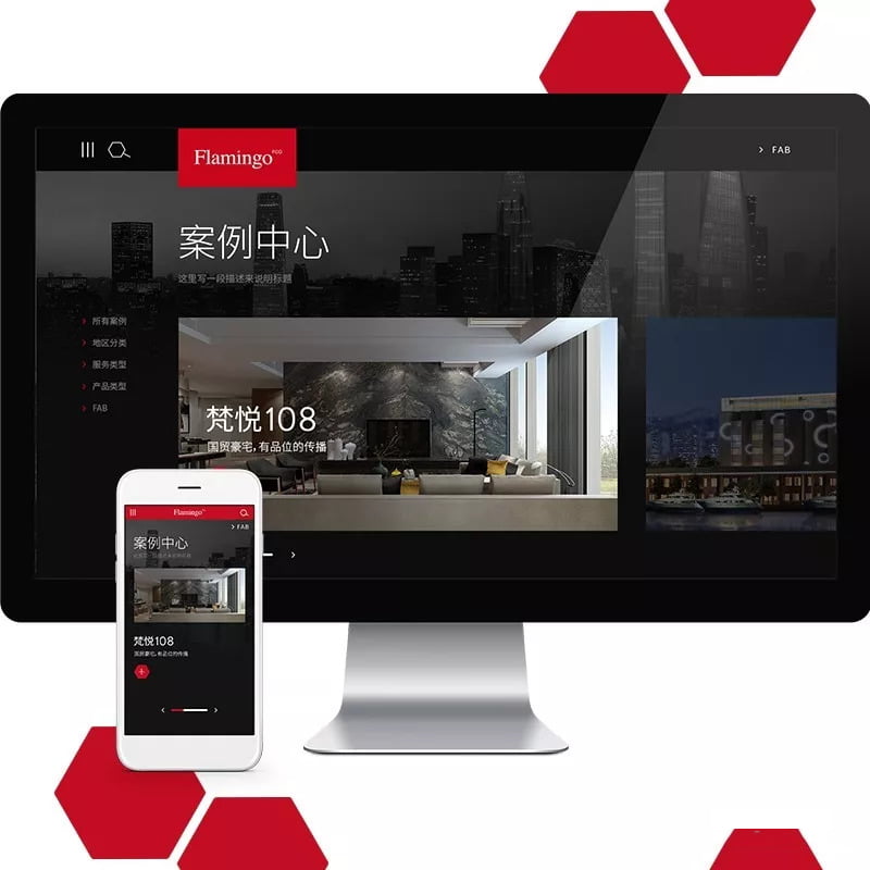
We recently published Flamingo Group’s website.

Flamingo Group is one of China’s most prominent brand marketing groups with services that include strategy, brand positioning, consulting, advertising, public relations and events, digital marketing, brand incubator and accelerator, and venture capital. You will recognize some of their clients such as ofo.

,

CHALLENGE: TRENDY AND SUSTAINABLE

With hundreds of millions of websites in existence, there are web designs ranging from basic text to levels of interaction that spark curiosity even among the most web-savvy among us.

We recognize when an organization sets out to create a new website, it is our responsibility to look beyond the trends of the moment of web design to understand how these may change in the future and to understand the ways in which the company itself will evolve in the years to come.

,

EXPECTATIONS ON A DESIGN AGENCY

As Flamingo Group is a creative agency, many first impressions about the group, by potential clients and future employees, are made immediately upon arrival to the website.

Below an outline of how we worked to create an modern and evolutive design.

,

VISUAL PATTERNS

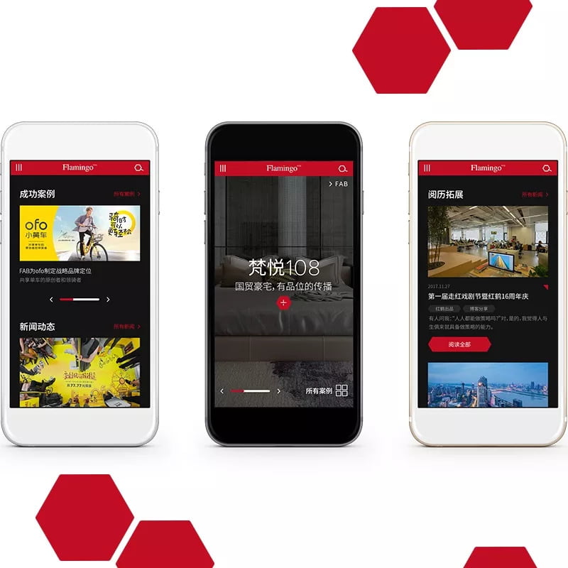
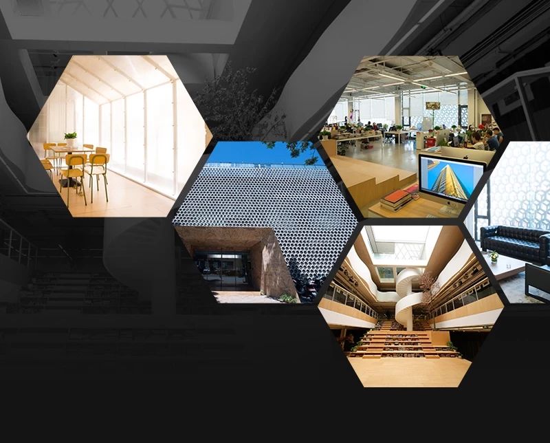
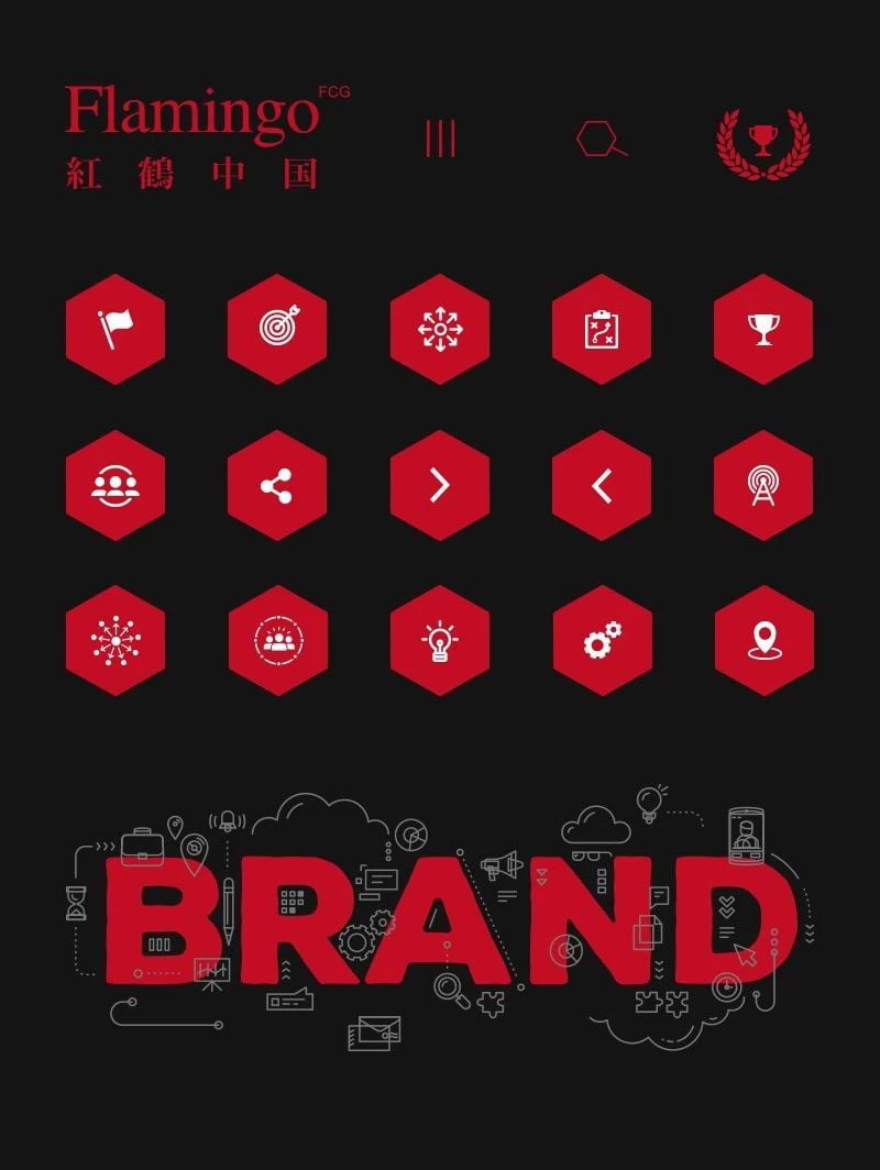
Much of our inspiration came from Flamingo’s own offices’ use of hexagonal design. You can see throughout the website the use of the hexagonal shape in the minute details creating or a unique and meaningful web visual identity.

,

HIERARCHY

Flamingo wanted to make their site experience different from a simple hierarchical, informational website. We enjoyed the challenge of designing a less traditional hierarchy, while still ensuring that the user can easily navigate through this less familiar path. We utilized an anchor tab, sticky on the left, so that the user can easily access the content that they are most interested in at all times and β€œlearn” this new navigating path intuitively.

,

TO ANIMATE OR NOT

Dynamic effects are often the first element to become outdated. We work to understand what effects are here for just a moment and which ones are fleeting based on usability, functionality, and implementation. We understood for Flamingo it is important to portray the group as cutting-edge while empowering the website to grow while still preventing putting them in a position that would leave them with an outdated website within a year.

LANDING SCREEN AND THE TARGET USER

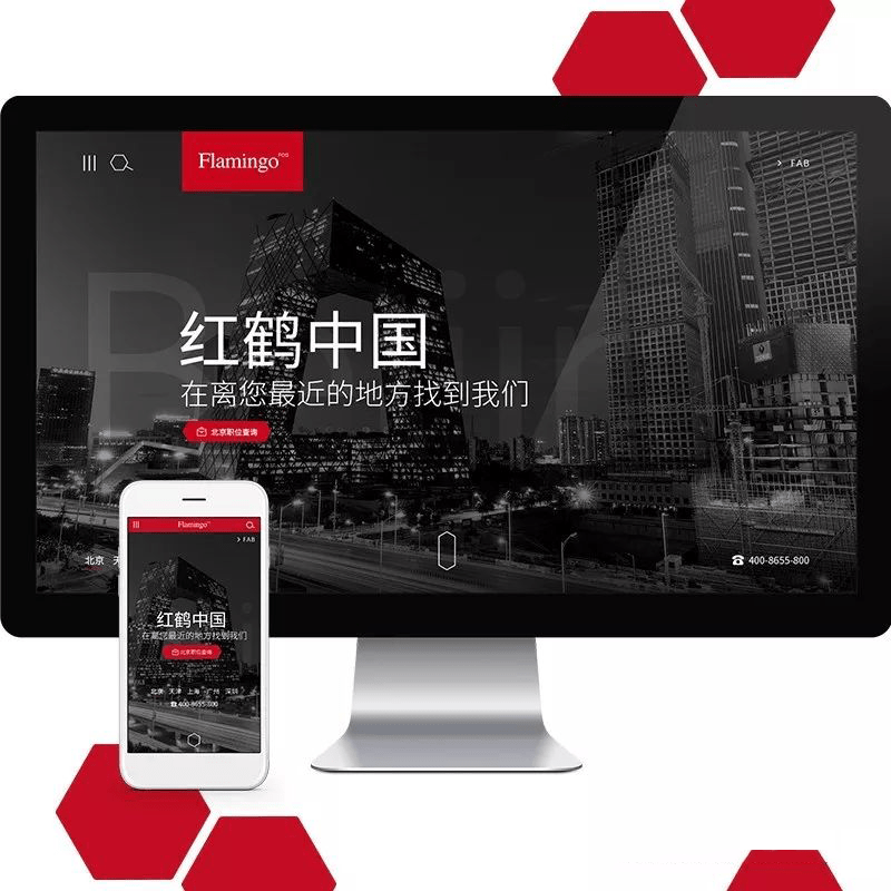
As with many groups, Flamingo has offices all over China. In additional to new clients, one of their other named main target audiences is future employees. The home page first screen not only makes an impact of their brand and size, but it simultaneously serves both the potential client and the potential employee who both see immediately the multiple location reach and easy navigation to reach their visiting goal.
,

SCOPE:

See it for yourself: www.chinaflamingo.com

Related articles

Singles’ Day in Numbers: Key Trends You Should Know

Singles’ Day in Numbers: Key Trends You Should Know

0 min read
November 21, 2024
How to Create and Verify a Douyin Account for Overseas Companies

How to Create and Verify a Douyin Account for Overseas Companies

3 min read
November 19, 2024
Let’s Talk.

Ready to expand into the
China digital ecosystem?

1999 characters left
This field is for validation purposes and should be left unchanged.