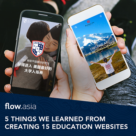

The last couple of years have seen a dramatic shift for the Chinese education market. Key decision-making factors are now being placed on finding the “right fit” and moving beyond just rankings. Here are a few key things we have learned over the last 12 years of designing education websites.
1. Make it engaging
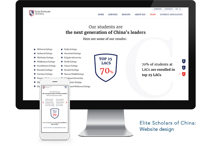
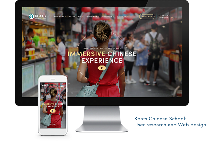
People like A LOT of information when making an education-related decision, but that doesn’t mean it has to feel like a lot. A well architected and designed website can handle any amount of information…even when viewing on a smartphone.
2. Be WeChat-friendly
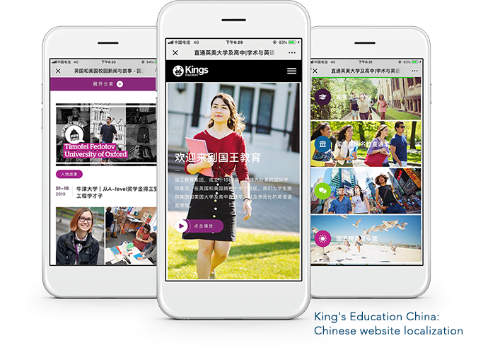
Though parents and potential students are likely to be the final decision-makers, the website will be shared between grandparents, aunts and uncles, and likely a neighbor or two before anyone is convinced.
3. Portray your true self
As students and parents place more and more attention on finding education that aligns with their interests, goals and personality, the website needs to recreate, both in look & feel, the true environment of the school.
4. Keep applications simple
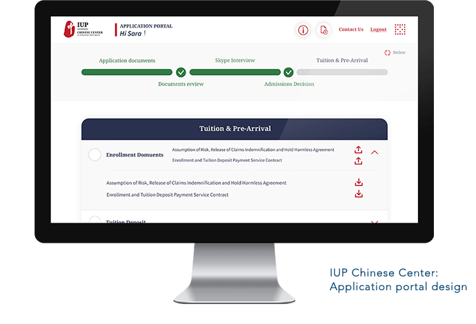
Application forms don’t have to be painful to fill out. Based on years of research and experience, Flow has learned how to design application forms that are intuitive and efficient- for both the school and the applicant.
5. First impressions matter
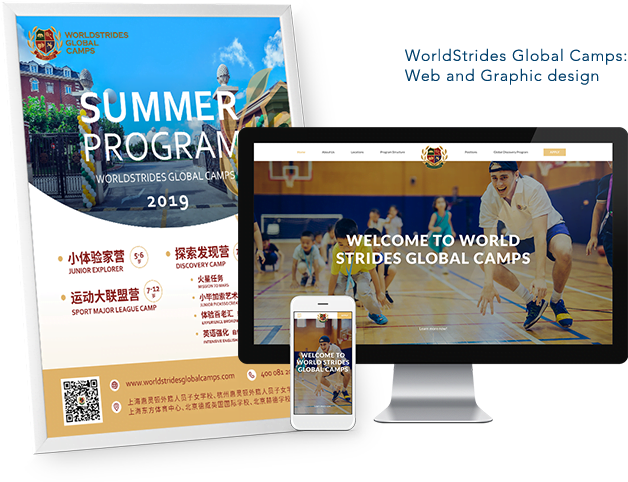
The competition is fierce and first impressions matter. From the moment people first interact with the school, they will begin to form opinions. It is essential that the marketing materials and website are cohesive and up-to-date.
Final thoughts. As always, design with care, keeping your human audience in mind. If you would like to collaborate on your next education project, another type of project, or just want to chat, click on the button below to follow us on WeChat.

